Class 4: Structured Documents
Computing for Molecular Biology 1
Andrés Aravena, PhD
26 October 2020
Today we will focus on a key idea
Structure
To understand complex things, we organize them using structures
The most common structures are
Tables: several things with the same set of attributes
Hierarchies: like files and folders, or taxonomy
Networks: social, biologic, communications, etc.
Text documents have hierarchical structure
We can see it in papers, thesis, etc.
- Title
- Sections
- Subsections
- Lists
- Figures
- Tables
- Subsections
- References to other works
Two versions of the same paper
Two versions of the same paper
Let’s take a look at the paper
Searls DB. “Ten simple rules for online learning”. PLoS Computational Biology. Epub 2012 Sep 13.
Find it at https://www.ncbi.nlm.nih.gov/pmc/articles/PMC3441493/
Version 1: PubReader format

Version 2: Plain text format

What is the difference?
First version has text and style

It is a rich text document
Title, author, and sections are marked with
- size
- weight
- color
Second version has only text, no style

This is a plain text document
The text is the same
There is no style
Plain text have no structure

It is hard to find the document parts
- What is the title?
- Who is the author?
- What are the sections?
Decoration marks structure
For example
Change font style: Bold, italics
Change font size: smaller, larger
Change alignment:
centering
You could do it with an old typewriter

This is how it was done in 1946

(this is the first description of modern computers)
You can also do it in Word®
This is what most people do

The problem
Style is not Structure
In word processors like Word®,
What You See Is What You Get
This is sometimes called WYSIWYG
It is easy to change fonts, sizes, colors and other visual attributes, without paying attention to structure
It is like a house
Structure makes the house solid.
If you only do decoration, the house looks nice but it is not solid.
Wall structure come first, “painting” is secondary
Signs that something is wrong
- You spend too much time choosing fonts and colors
- The style is incoherent
- Changing style is a lot of work
- It is hard to make a Table of Contents
- You use the mouse a lot
Separation of form and content
Writing and styling at the same time is a bad idea
The idea is to write first, and style later
Choose the style just before publishing
What You Mean Is What You Get
- The information you enter defines the meaning of the document
- You mark the structure
- The program generates beautiful output
- Style can change
Many versions of the same paper
One version on PubMed Central

It can be in “PubReader” Format

It can be in PDF format

Or in the PLOS website

All have the the same structure
even if they have different styles
How to write a structured document
Separation of concerns
You are scientist, not a graphics designer
- You read papers
- You plan and do experiments
- You analyze the results
- You write the papers and reports
- You do not choose fonts, colors, or sizes
Focus in the Structural elements
- Sections
- Subsections
- Normal Paragraphs
- Lists
- Numbered
- Unnumbered
- Computer code
Other Structural elements
- Figures
- Captions: description and details
- Tables
- Headers
- Columns and rows
- References and citations
- Metadata (author, date, jorunal)
Decorative elements are not essential
Do not worry about
- color
- font family
- font size
- centering
- section numbering
You can change them later
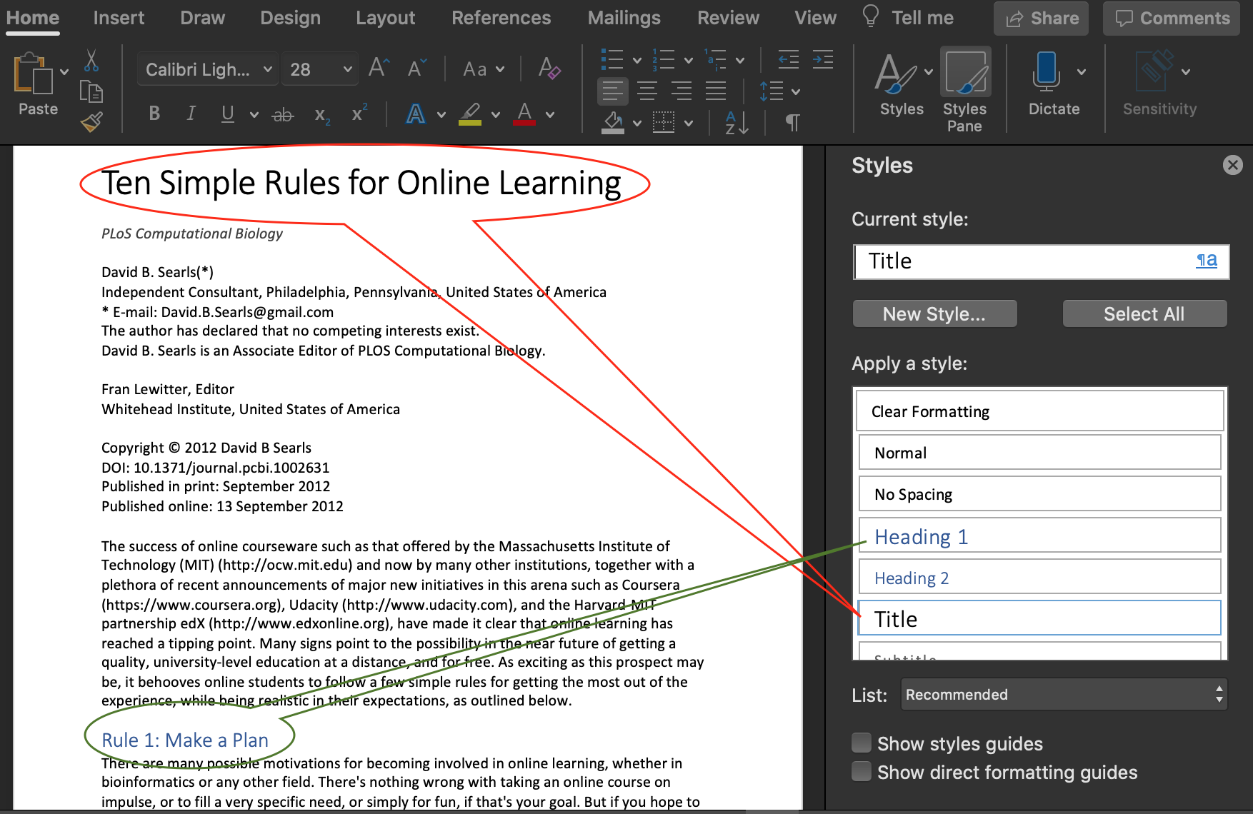
Use Styles in Word
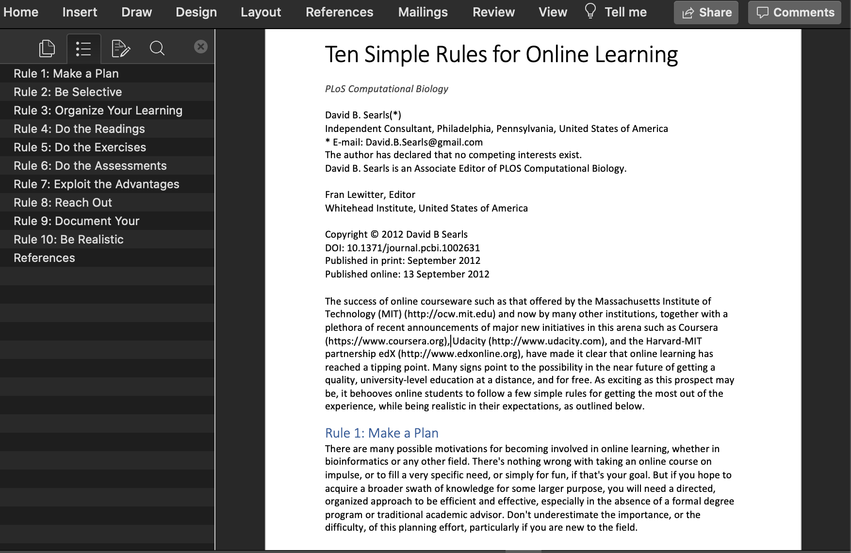
One title, several headings

Now the document has structure

Compare with “only decoration”

Now it is easy to change the design

The decoration is coherent

Word has many designs

And several Themes

Advantages
- Document looks nicer, with less effort
- It is easier to read and understand
- The style is coherent
- Important for “Final Project”
- It is easy to make the Table of contents
- The distance between paragraphs is correct
- Page breaks are in the correct places
You can do the same in PowerPoint
Choose the style in the Slide Master

Summary
Summary
- Documents need structure
- Structure is more than style
- Structure comes first, style comes last
- Focus on the structure
 Tables: several things with the same set of attributes
 Hierarchies: like files and folders, or taxonomy
 Networks: social, biologic, communications, etc.